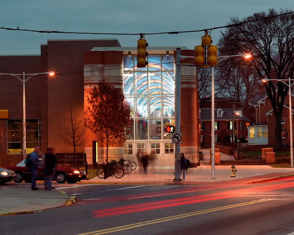
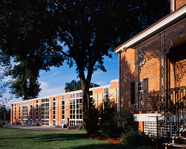
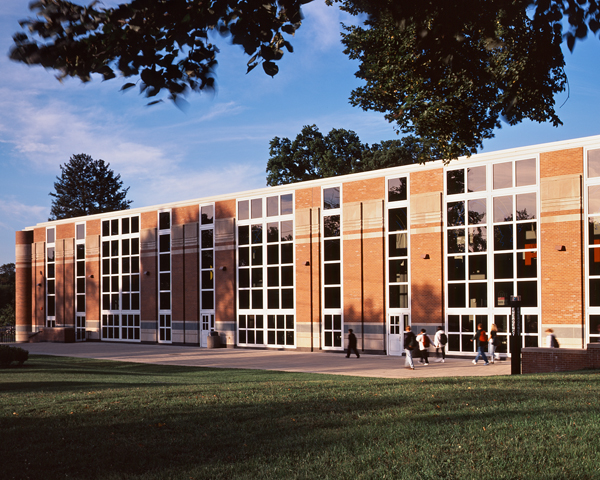
As a whole, the typical student center is inevitably awkward. Because it must accommodate many uses on few floors, it can easily look like a low warehouse or shopping mall. For this reason VSBA concentrated the bulk of the new Trabant University Center within the interior of the site, thereby maintaining the fabric of the existing neighborhood buildings at the perimeter of the block. These charming buildings and little houses maintain the town’s historical aura while the bulky rear of the student center hides behind them.
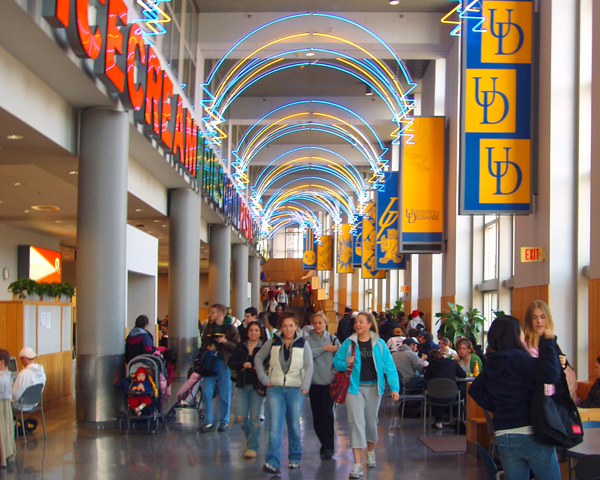
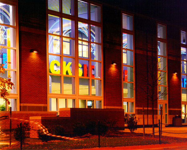
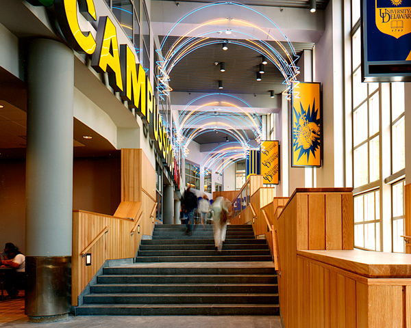
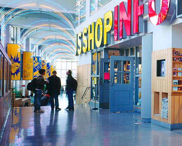
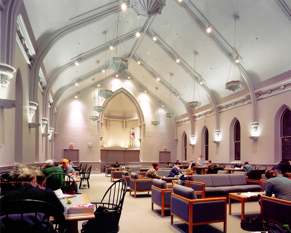
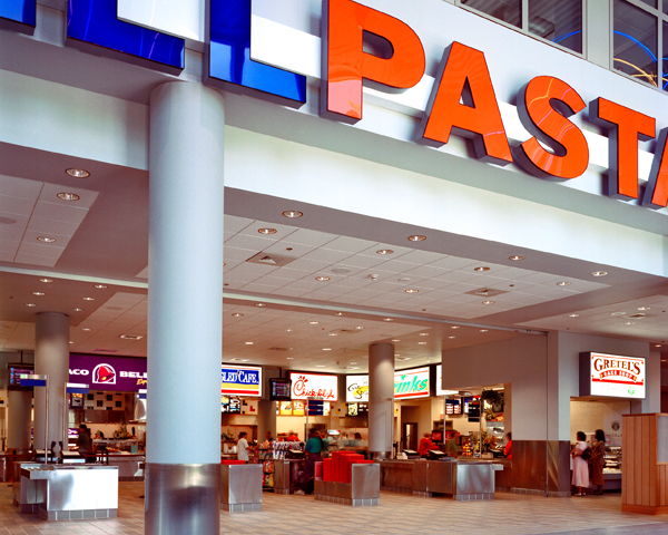
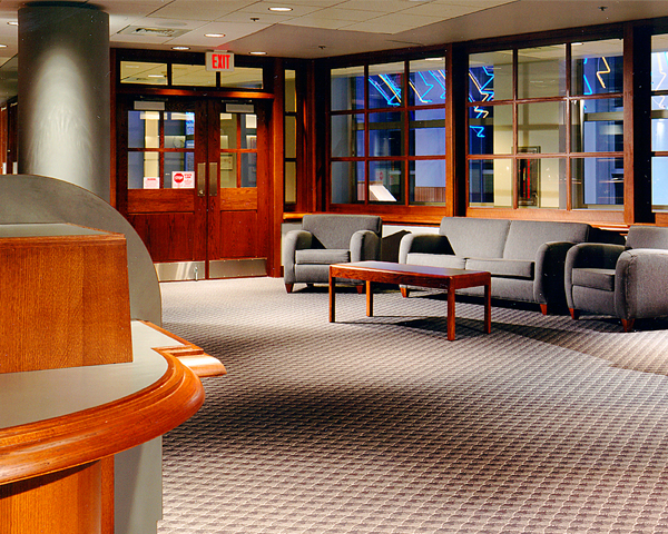
A gallery-arcade runs through the heart of the student center, aligning with one of the campus’s dominant pedestrian routes. Along the outside edge of the arcade is a kind of side-aisle — a zone where one can rest or sit to talk, eat and/or ogle; beyond is a vista of the street. In contrast, the space on the other side of the arcade is very active with commercial-like signs proclaiming a variety of eating places, a bookstore, kiosks, and other services. Above, a series of meeting rooms overlooks the gallery. Reinforcing the gala effect of the gallery are banner-like signs that can be decorative or informational. Decorative arches of low-intensity neon tube span the gallery and work to unify the contrasting sides of the space. A secondary route runs east-west to connect a large multi-purpose room, study lounge, auto drop-off, and adjacent parking garage.
Trabant’s design acknowledges (without mimicry) the campus’s rich architectural history. In spirit (but not literally) it’s Georgian — in its materials, rhythms, and classical allusions — but it’s true to our time and appropriate to its size and scale. Just as the architects of the 1920s Georgian buildings in the historic campus center adapted the style to their time and purposes, so we’ve adapted it to ours.
